Hi Everyone, sorry for the delay.
This is the 2014 challenge "COIN" design poll, that will run until very late on Sunday, the 4th of May. Below are all the designs submitted in this category (unless I've missed someone, please let me know if I have), in the order of when they signed-up.
You are voting to choose which Design will, potentially, get manufactured as the official forum Challenge Coin this year.
You can vote for one, some or all the design entries, but only one vote per design please.
Don't forget to also check out the Tool design poll, coming soon.
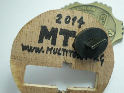
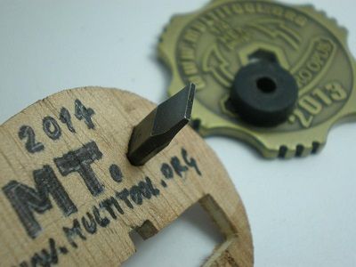
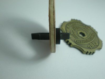
1. Nhoj's Entry.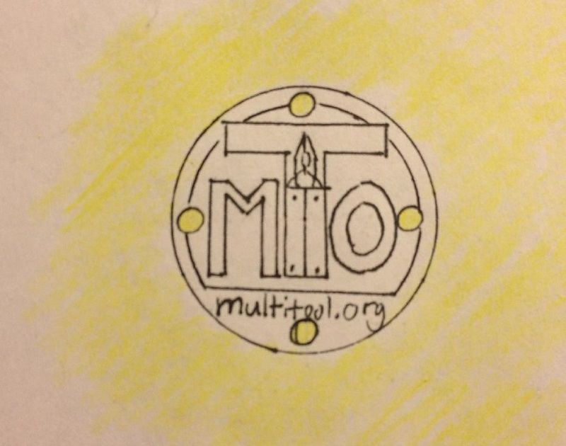
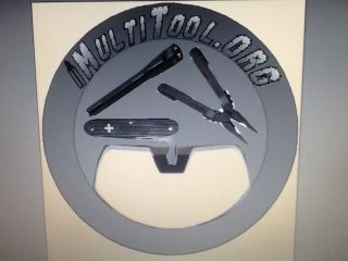
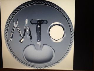
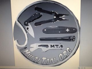
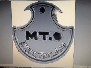
My challenge coin design can easily be carried with you on your keys. It features four holes which key rings can be attached. You can either use the coin as a centerpiece with multiple items coming off of it, or attach one hole to your keys.
The holes can also be put to more creative uses of attachment to objects (see 2nd post in my coin thread). On the front of the coin I included the abbreviation of the website "MTO" and put in the pliers logo as part of the T. I think these are important in how to community identifies itself and should be included. The back says "solvendis vita" (solving life) but this could be changed to other Latin. Overall this is a well rounded coin ( pun intended

) in the way that it has both design and function.


Nhoj's thread link:
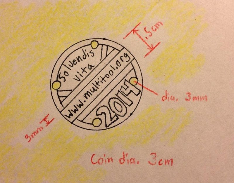
http://forum.multitool.org/index.php/topic,51795.html2. Raukodur's Entry.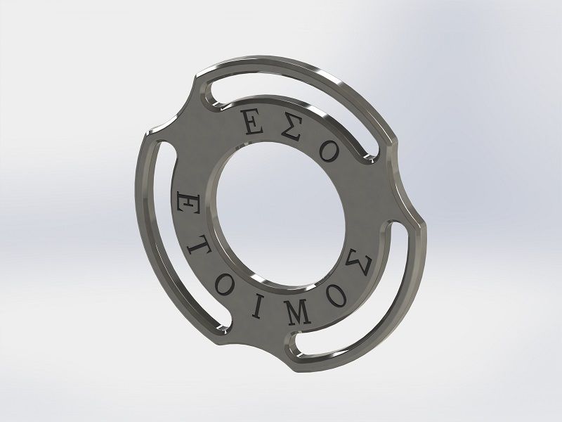
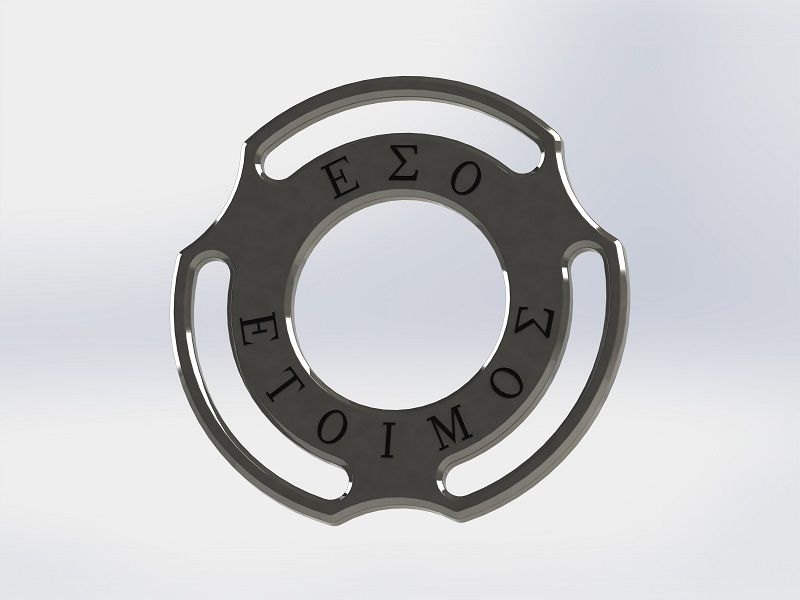
Dimensions:
The coin is 32mm in diameter, much smaller than the coin behind it which is 43mm in diameter. The coin is 2mm thick and the three rims of the cut-outs are 1.5mm deep, allowing for better installation and removal of small split rings.
Lettering:
"Be prepared" (ΕΣΟ ΕΤΟΙΜΟ) - ancient Greek proverb.
On the other side we could have: MTo 2014
Design purpose:
A keyring attachment challenge 'coin', which you can put on your keyring, and use as an attachment point for other keyring attachments. In this way it is functional in a way that doesn't overlap with the other tools we use and so provides real usefulness as well as being a challenge coin for MTo. And of course, there is the aesthetic appeal of the trisymmetrical circular design.
Raukodur's thread link:
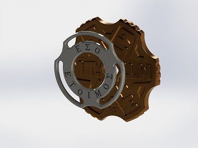
http://forum.multitool.org/index.php/topic,51242.0.html3. MadPlumbarian's Entry.Since Mad couldn't decide which of his designs should be put forward......here's all of them.
Enjoy.
MadPlumbarian's thread link:
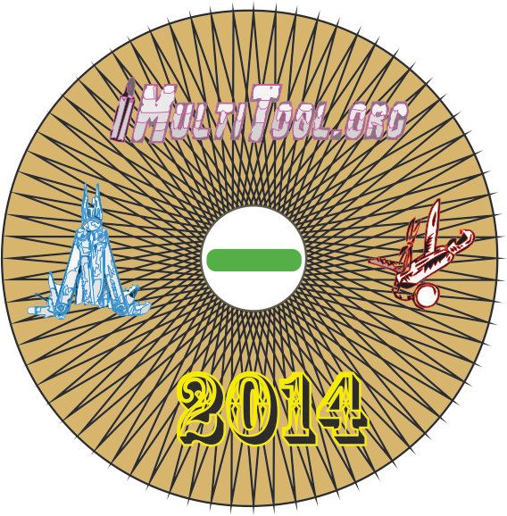
http://forum.multitool.org/index.php/topic,51467.0.html4. enki_ck's Entry.
Placeholder for the summary on the simpler coin design, i.e. without the screwdriving outer ring (that will be included in the Tool voting thread as it more complex).
enki_ck's thread link:
http://forum.multitool.org/index.php/topic,51522.msg872392.html#msg8723925. Yadda's Entry.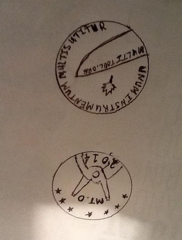
On the front an impression of the pliery multitool. 7 stars as a subtitle nod to the anniversary and the year.
On the back a knife blade impression as a nod to our SAK brothers, my Latin phrase and a poorly drawn maple leaf as a subtitle suck up for Grant's vote as the founder....
My project at work ran oversold no real time to draw or seek more opinion.
Yadda's thread link:
http://forum.multitool.org/index.php/topic,51261.0.html6. Microbe's Entry.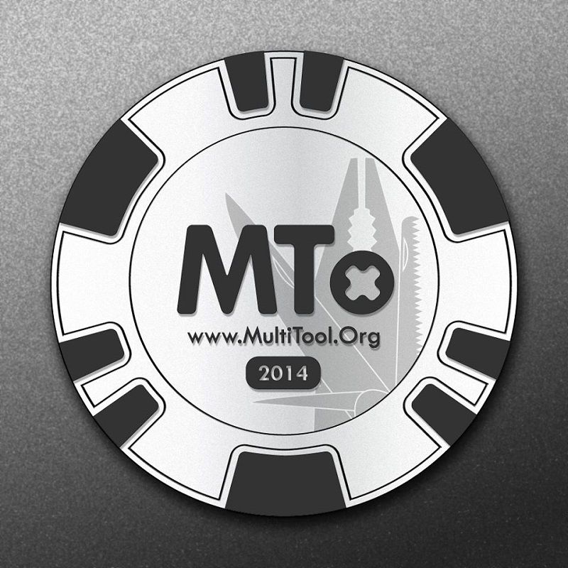
My challenge coin design was influenced by poker chip designs. Hence, it could be produced as a poker chip, from ceramics, which would be considerably cheaper as a metal coin. The design is to be working as a poker chip, and will be stackable in the same way as a poker chip. If you would get a set of these, you can actually use them as custom chips in a poker game at your place. As to the design - check the images, it is quite self explanatory.
Even if the design was made with ceramics in mind, it can be produced in metal. Costs would increase depending on the production methods and the metal that will be used. For example: S30V or Sleipner could get quite expensive. I would suggest to one up the cheapest available metal, as we all know the cheapest stuff is usually not the best stuff.
Microbe's thread link:
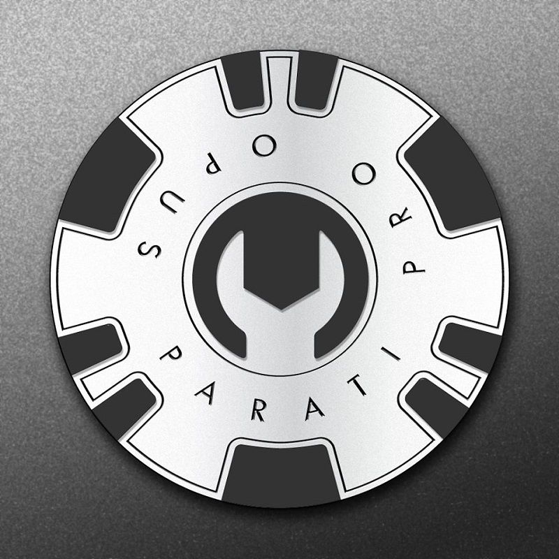
http://forum.multitool.org/index.php/topic,51243.0.html7. Ombudsman's Entry.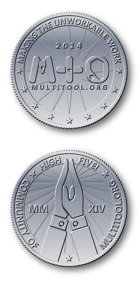
Placeholder for summary (pretty self-explanatory though)
Ombudsman's thread link:
http://forum.multitool.org/index.php/topic,51489.msg880081.html#msg8800818. Corwyn's Entry.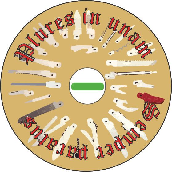
Face 1:
Plures in unam - Many in one (in piglatin)
Semper paratus - Always prepared
Sexy Old English Text font
Foldout of SAK tools (shamelessly stolen from a Wenger catalogue - a decent designer can replace)
A Tritium vial embedded in the centre. However if there are radioactivity/technical concerns, it can be replaced with regular glowy paint-thingie - StayGlo style.
Face 2:
Multitool logo (YEEY!)
Leatherman graph edited off the web.
SAK graph shamelessly stolen from web - decent designer can redo
2014 in sexy Rosewood font, fitting our logo some filler squiddly things made to the best of my (seriously lacking) skills.
Corwyn's thread link:
http://forum.multitool.org/index.php/topic,51301.0.html9. PPCAPache's Entry.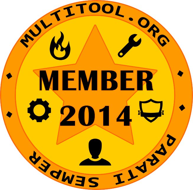
The First Image; This is to represent the owner as a Member of the MT.O for 2014, the icons are about being prepared for the unknown, having Fire (Light), Cog (Fixing), Spanner (Tools), Person (Members) and Shield (Protection).
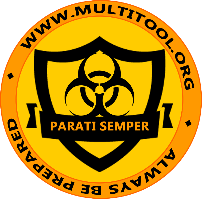
Second side is all about "Always being prepared" (Parati Semper) and how this is the motto of most EDCer's. The Bio sign can be changed out with the MT.O logo or text, but I thought we are all about being prepared for the unknown issues and concerns.
The last image was more of a simplified thought the LM image was only to represent a tool.
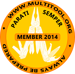
PPCAPache's thread link:
http://forum.multitool.org/index.php/topic,51374.0.html10. RT1969/Sweety-Sama's Entry.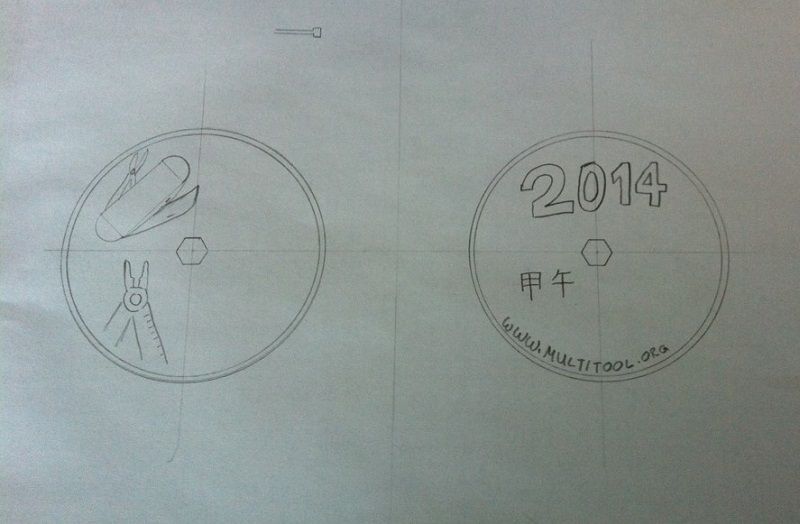
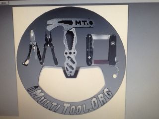
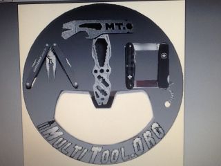
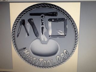
One side is supposed to show a Leatherman (or something resembling) and a SAK (yeah, yeah, my fiancé already told me the knife goes the wrong way..).
On the other side you see the year, the website and I looked up the Chinese sign for horse, actually wood-horse (this should be a suggestion for the year of the horse).
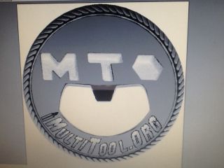
I liked the idea of the hexagonal hole and before reading in the other two posts of the last year I thought to myself, that it would be good if it's big enough to maybe screw a M6/M8 or M10 hexagonal screw
2014 is the chinese Year of the Wooden Horse. So what about a Trojan Horse (Maybe made out of Multitools, Leatherman/SOG legs, 91mm/84mm SAK torso, 58mm SAK head)?
And then the slogan "More than you expected!"
The other side would be a MTo Design like the last years edition.
Super crazy version: Have the whole coin in the form of the horse, with the head acting as bottle opener, tail as awl or screwdriver, the "v" between the hind legs a belt cutter etc.
Please feel free to post which design you voted for and elaborate on what aspect of the design drew you to it, or any thangs that would have made other designs more attractive to you. This won't affect this year's design, but may help define future iterations in following competitions.

 Poll
Poll